It would be great if we could highlight text in a certain color when leaving comments on moves. This would make it a lot easier for opening studies with long branches.

Along with that, when we come across variations, the option to choose between the options should be shown somewhere in the centre to catch the player's eye. For example, ChessBase shows it directly in the centre and asks the user to select one option.

It so happens that the LiChess Tools browser extension has this feature, but only for the users of the extension.

I use "interesting move" as a dummy attention grabber. To put some life in the wall of SAN syllables, so I can see faster the branching skeleton of that wall... for what I thought needed attention (whether I am reading or sharing).
But that is not about the prose of text attached, which itself might need some visual clues to articulate its points while reading, so, at the end of the paragraph, if something did not compute, one would not have to start again from the FIFO or FILO end-point of the beginning to find back where the sharp turned of concept in the blurb, was missed.
Might be a crutch, but compensating for lack it, does not seem to be about chess, does it? I would just be learning the skill to compensate for that lack of visual aid, in the available chess communication resources? Which is not chess itself, well, It might, at large, but I mean the chess board logic, and emerging less logical rules of thumbs, or actual, autonomous arguments that might be buried in the colorless shapely string.
It feels even more cramped now, that Lichess has deprecated features for the member status in studies.. (web trend).
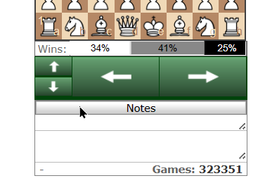
Since across variation was mentioned. I suggest big buttons for that. not only having to click on exact branch, aiming with mouse. but for example as in chesstree.net
This would allow delegating minimal procedural mental chunks to crossing variations at any depth from another branch to same depth (some things to iron, for different branches depths to leaves, but easy to discuss, if interested in first place), WHILE keeping high attention level on the board itself, not aiming with the mouse with retinal best real estate.
All my suggestions and the ones above, are of same nature.. Board is the visul and preferally most continuously sustain visual priority, for the limte human reasoning ablities in time and proximity in time between visual information changes..
I don't know how to voice this with common sense lexicon to people I do not know the common sense of, so I think going clinical and specific put that burden of making sense onto the readers not having my common sense.. Please try.
but yes.. font color might be not as mind bending.
While at that. in pretty much all backgrounds, I find the active chapter font background change of shade very subliminal. and when having to compare chapters or even fing which chapter did I even land on from a shared link, among all the others, I find this a thin type of bread.
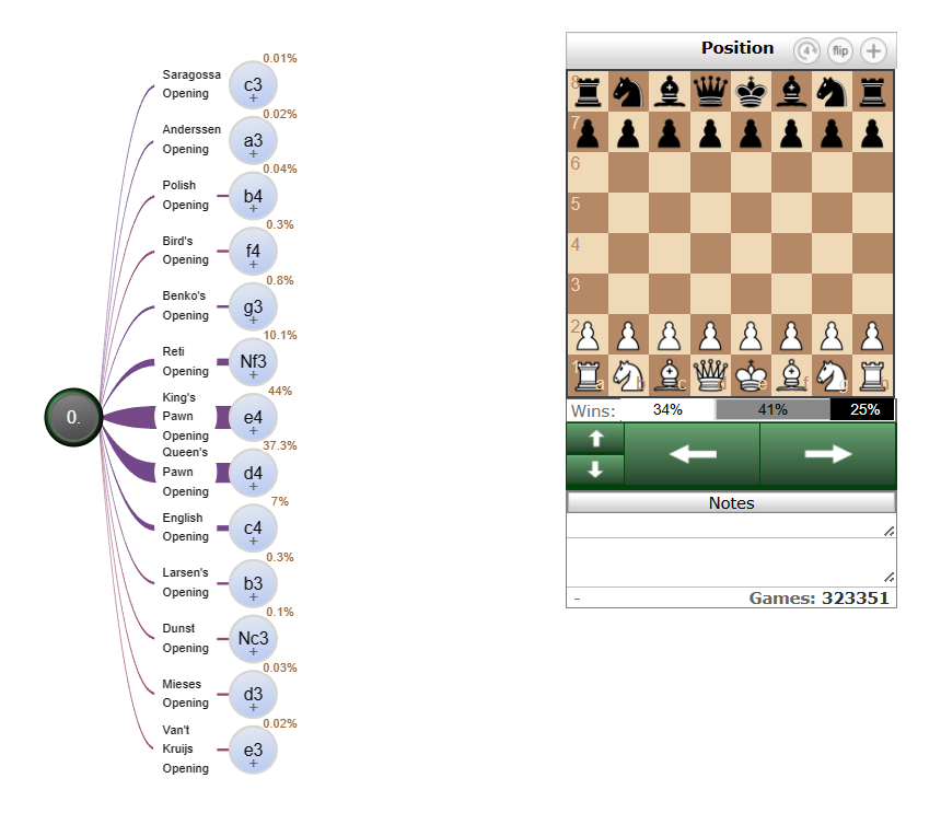
Edit: it the dark node, with 0. is it new? good on them.. special node that one.